The Best Pavilions from the 2015 Milan Expo
International expositions are temporary events, held in a new location every five years. They bring individuals together from all over the world to share ideologies and opinions.
Exposition sites typically consist of temporary entertainment venues, exhibits, and modular pavilions designed by contributing countries and private corporations with the goal of showcasing their architectural and technical prowess. The architectural pavilions are elaborate, often pulling from idealistic concepts that can only be manifested so literally in these periodic international celebrations.
Exhibitors push the boundaries of art and function, resulting in advances that impact society forever. International expositions of the past have resulted with notable structures such as the Crystal Palace, Habitat 67, the Eiffel Tower, the Space Needle, Buckminster Fuller’s geodesic domes, and many others. Expos have also hosted the public debut of mechanical computers, the Ferris Wheel, telephones, and most notably- Heinz Ketchup.
In honor of the close of the 2020 Expo (shifted to 2021-2022 due to the pandemic), I wanted to share some photos and perspectives from the 2015 Milan Expo. The event was themed “Feeding the Planet, Energy for Life.”
Exhibits challenged visitors to question their food-related culture, technology, tradition, and innovations. Are our consumption habits healthy? Are our food production rates sustainable? Can we use our resources more wisely? Do we know where our food is sourced? How can we integrate farming into our urban societies?
I was enthralled by the exhibits- but will focus on the architecture. Here is a glimpse of the expo:
Belgium: Designed by Patrick Genard & Associates and Mark Belderbos
Vietnam: Designed by VTN Architects


Brazil: Designed by Atelier Marko Brajovic, Studio Arthur Casas
The Brazil pavilion was the most exciting pavilion to visit. It looked like a hollowed out, rusted shipping container, but at a closer look- it was framework for a multi-level netted floor. This pavilion was part jungle gym and part museum!
Children and adults scrambled up the net to bounce, view the pavilion’s structure, and enjoy a playful moment in the warm Italian sunshine. It was a fun (and, at times, slightly uneasy) reprieve from the other pavilion typologies. Years later, I have zero recollection of the exhibit, but I loved exploring this whimsical structure.
Belarus: Designed by Kola-Zhytstsya
South Korea: Designed by Archiban, Solids


China: Designed by Studio Link-Arc, Tsinghua University
The China pavilion was GORGEOUS. From ArchDaily:
…the building’s ground plane is defined by a landscape of wheat (the “land of hope”) that references China’s agrarian past. This natural landscape transitions seamlessly into an LED multimedia installation in the center that forms the centerpiece of the building’s exhibition program.
The LED installation colorfully ebbed and flowed as the exhibition celebrated the complexity and beauty of the Chinese agricultural landscape. Under the undulating, translucent canopy of the pavilion, this space was one of the most memorable exhibits of the entire expo.
Uruguay: Designed by INAC
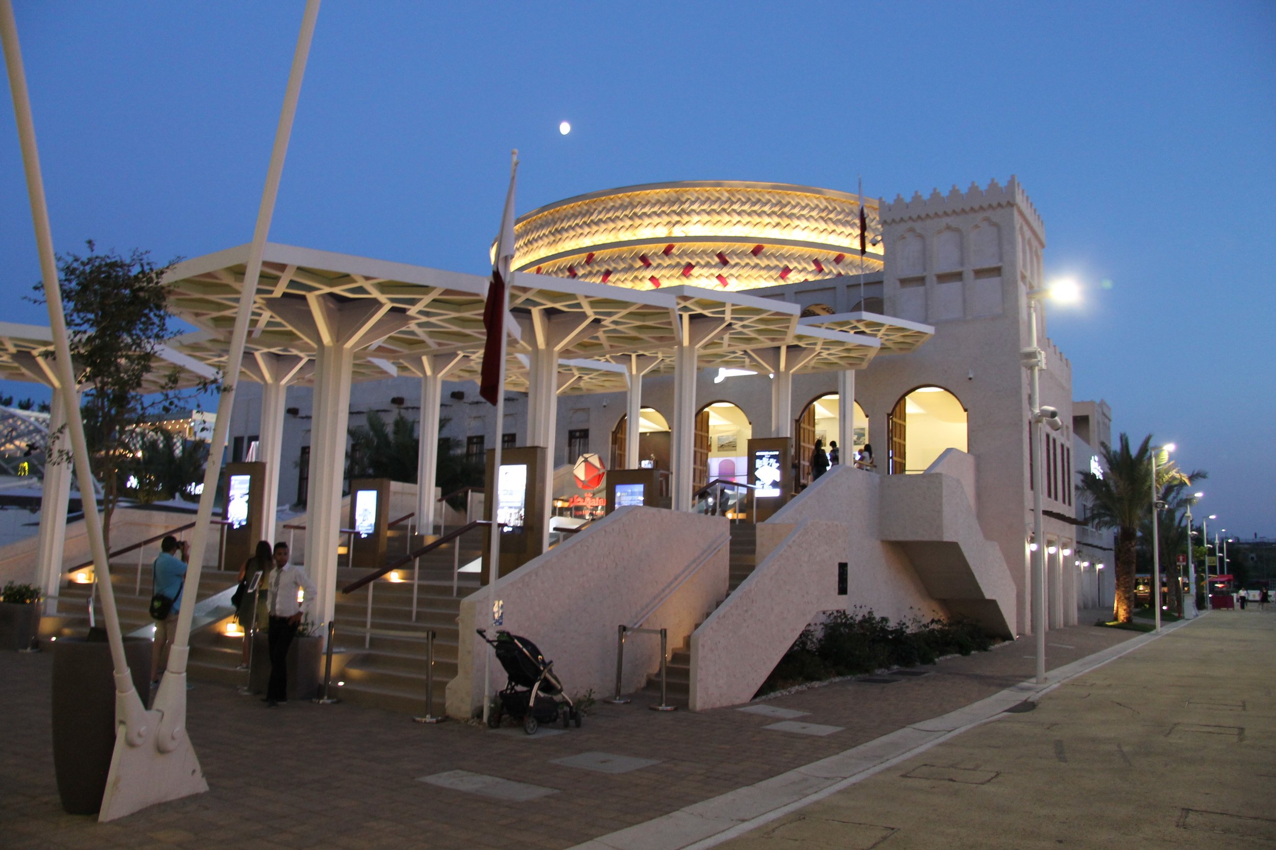
Qatar: Designed by Paradigm & Partners
United Arab Emirates: Designed by Foster + Partners
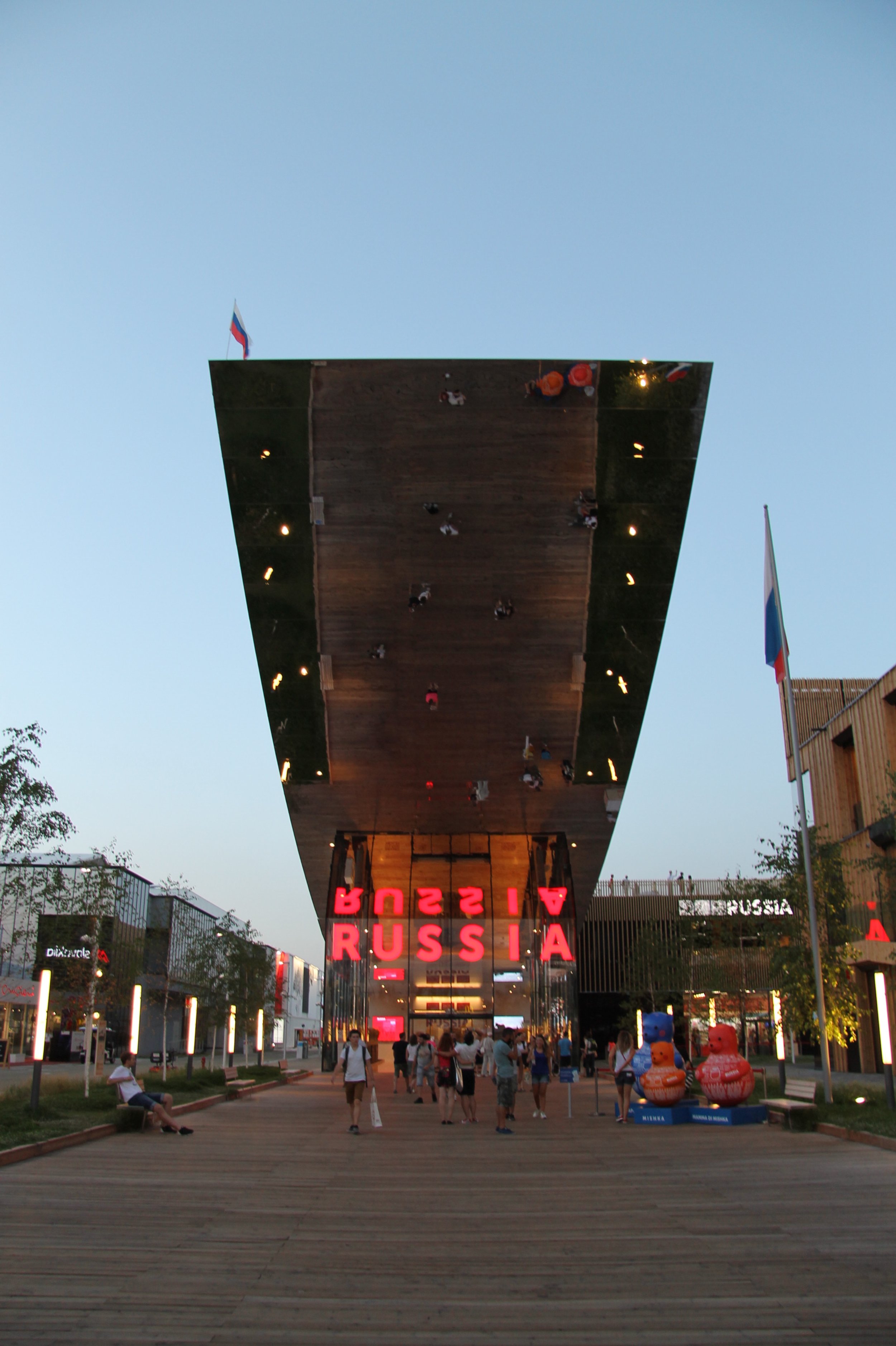
Russia: Designed by SPEECH
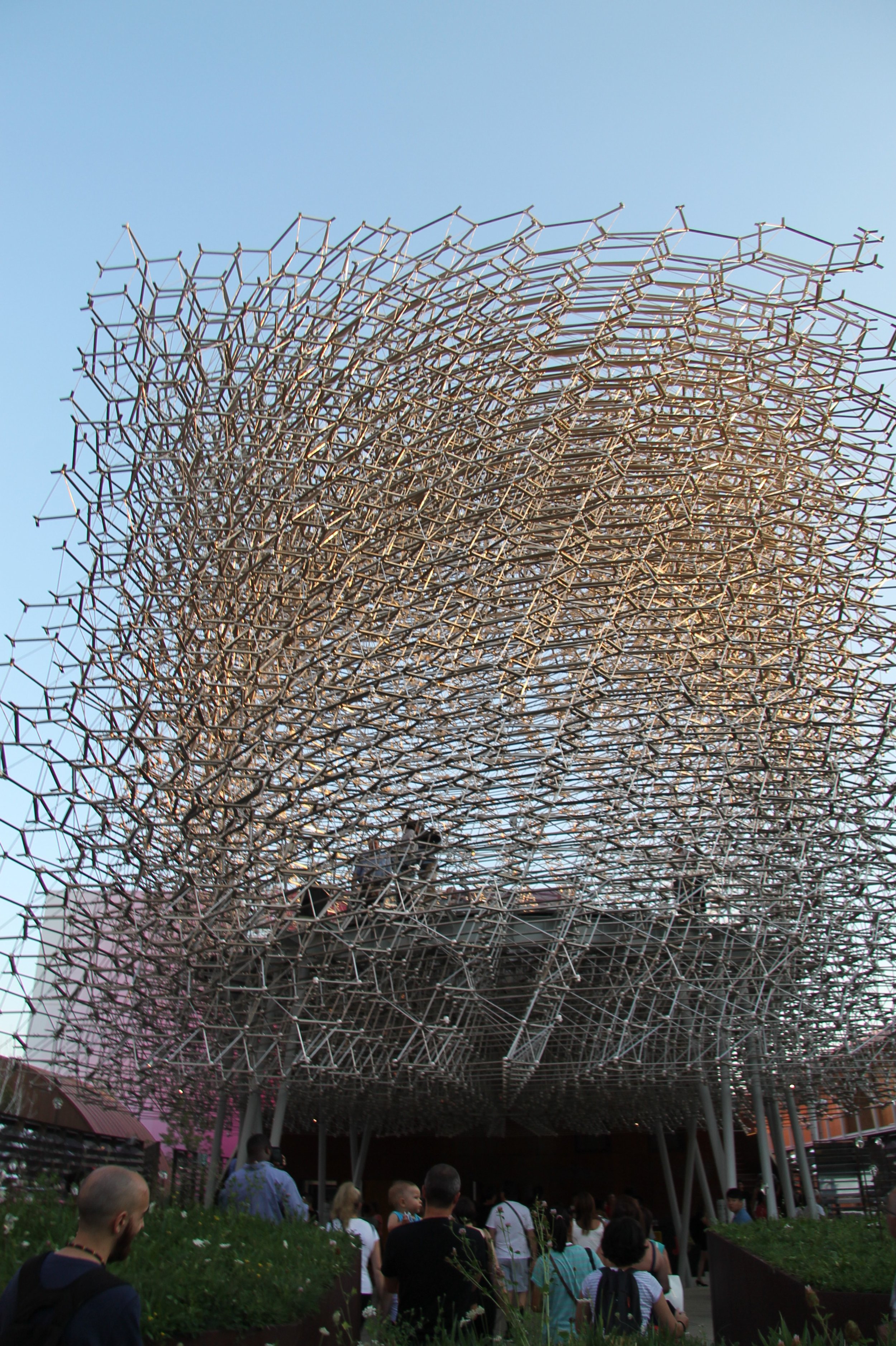
Great Britain: Designed by Wolfgang Buttress and BDP


Estonia: Designed by Kadarik Tüür Arhitektid
The Estonia pavilion was not elaborate in form, but provided an extremely rich variety of spaces inside. Sitting areas, vantage points, eating areas, and even swings added places to rest, collaborate, and enjoy. It was a place to watch and be seen; a place that comfortably hosted both static and active spaces for play and learning. Did I mention that the material palette was incredible!? Natural wood with white and black accents?! Yes please.
The architect’s design intent manifested itself flawlessly in this building. Here’s an excerpt from the architect:
The pavilion will not be formed for form’s sake but rather a framework for content that will bring the building to life.
The architectural premise for the pavilion will be a space with a clear identity, enabling visitors to get an idea of what Estonia is about. The pavilion is structured as a gallery of nature and creativity.
The pavilion composes of “nestboxes” stacked off-centre like cubes, forming the main volume of the building towards the Russian pavilion and along the side of the road inside the quarter. A “nestbox” is a high room creating a chamber-like sectioned-off compartment of space.
More Expo Photos


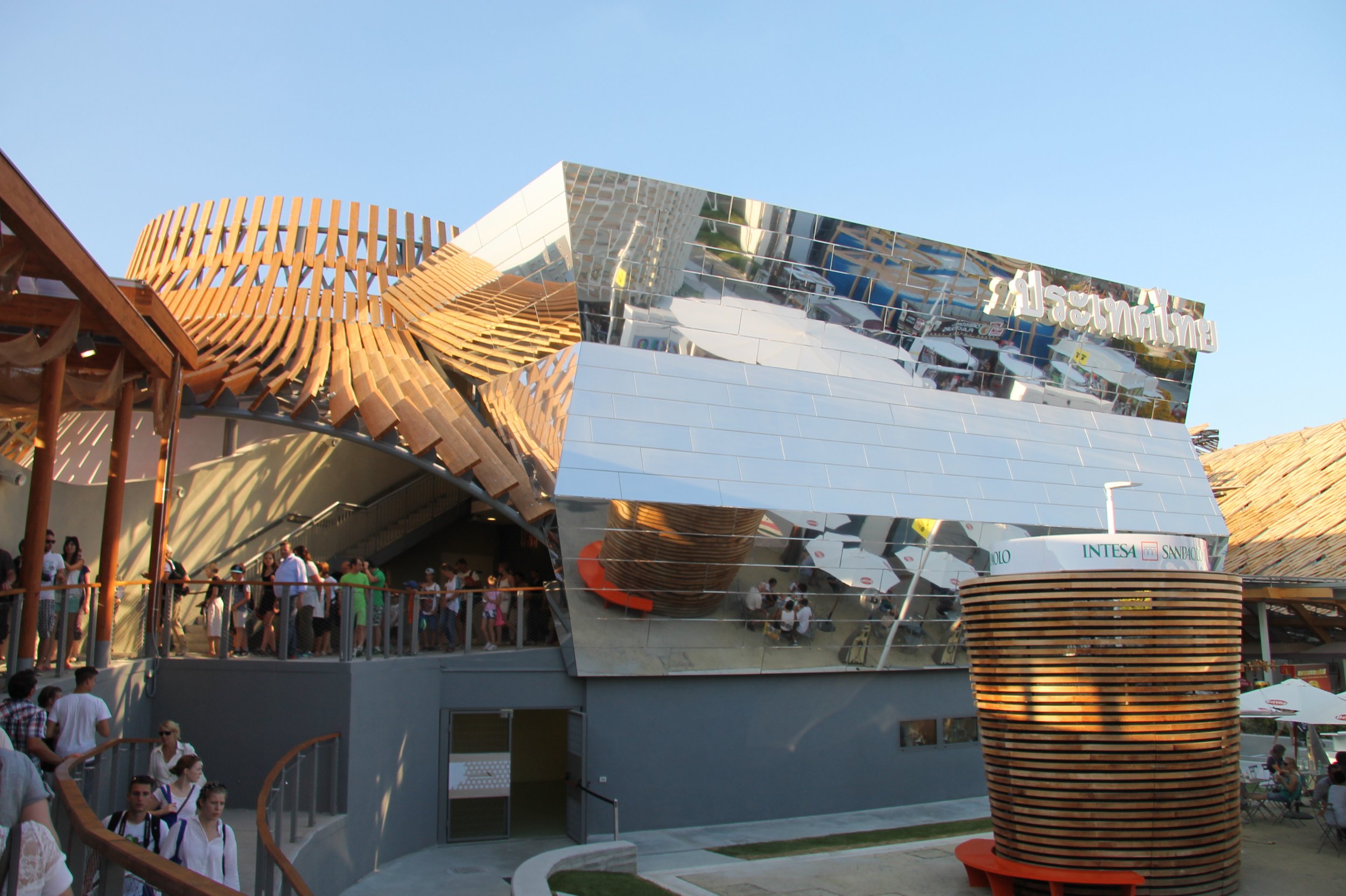


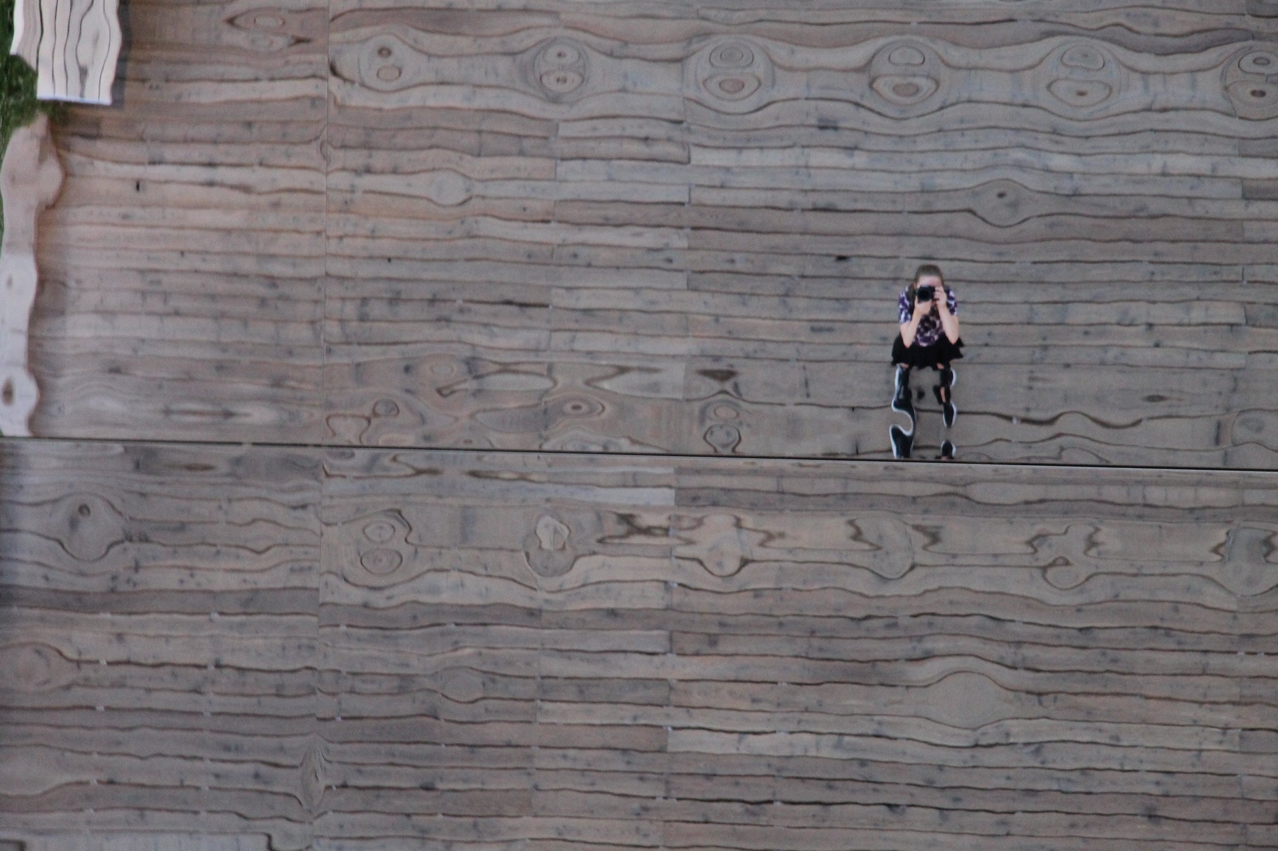


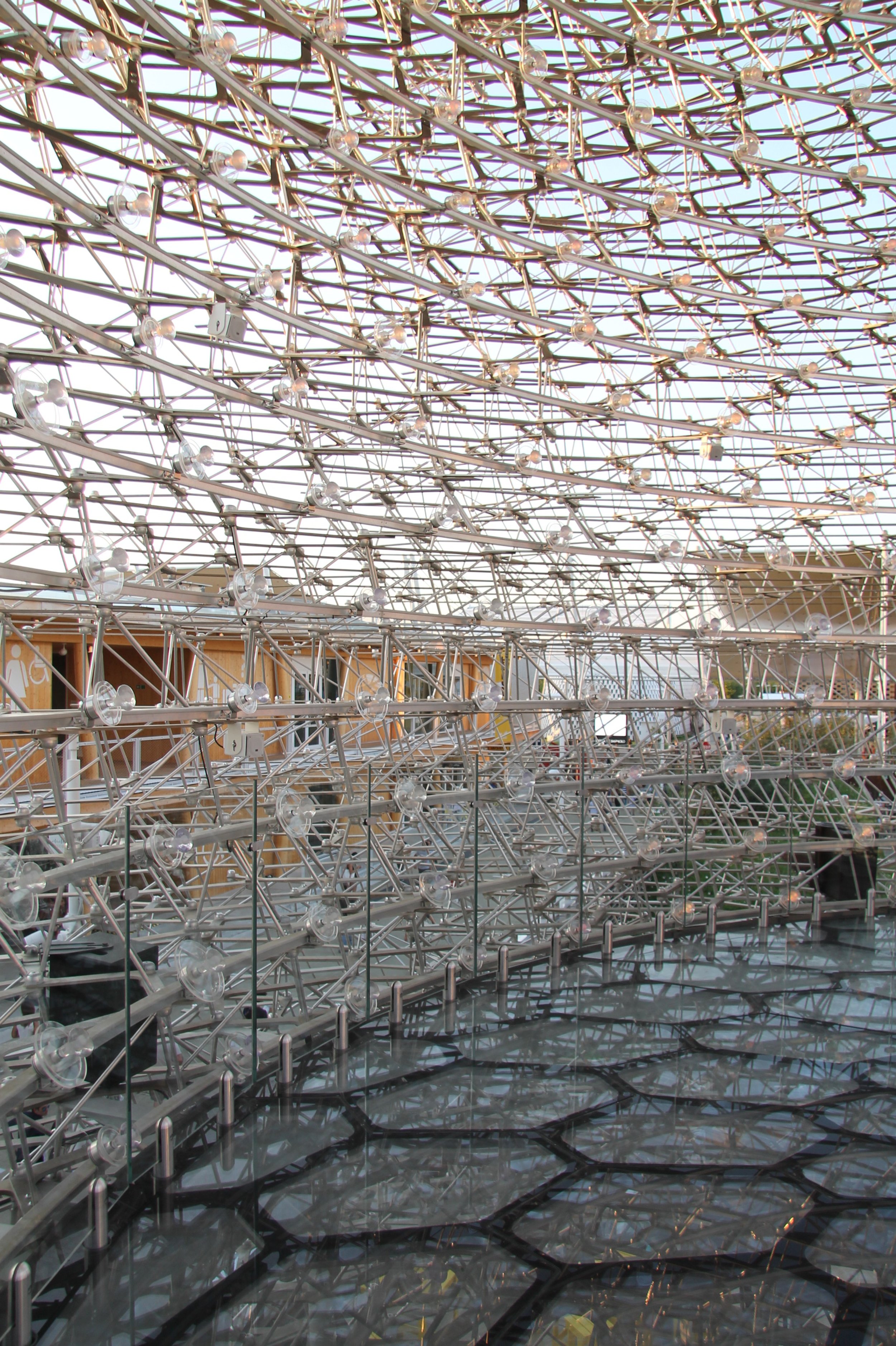


In summary, international expositions are an architect’s dream. There is no place in the world with such a vibrant mix of international interpretation of emerging architectural styles. To this day, I still feel invigorated and inspired by my brief day touring the Milan Expo.
I was unable to attend the 2020 Dubai Expo, but I am eagerly awaiting the 2025 Expo in Osaka. See you there?


