Aesthetic Addresses
Address markers… you’d think that a simple numeral next to the front door would be sufficient, but these homeowners take their residential signage to the next level.
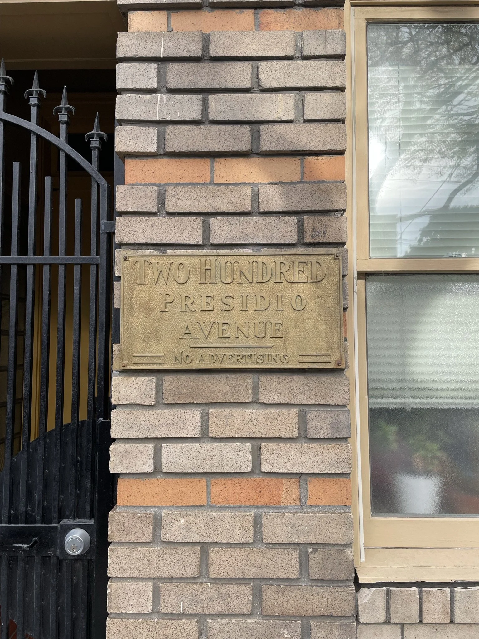
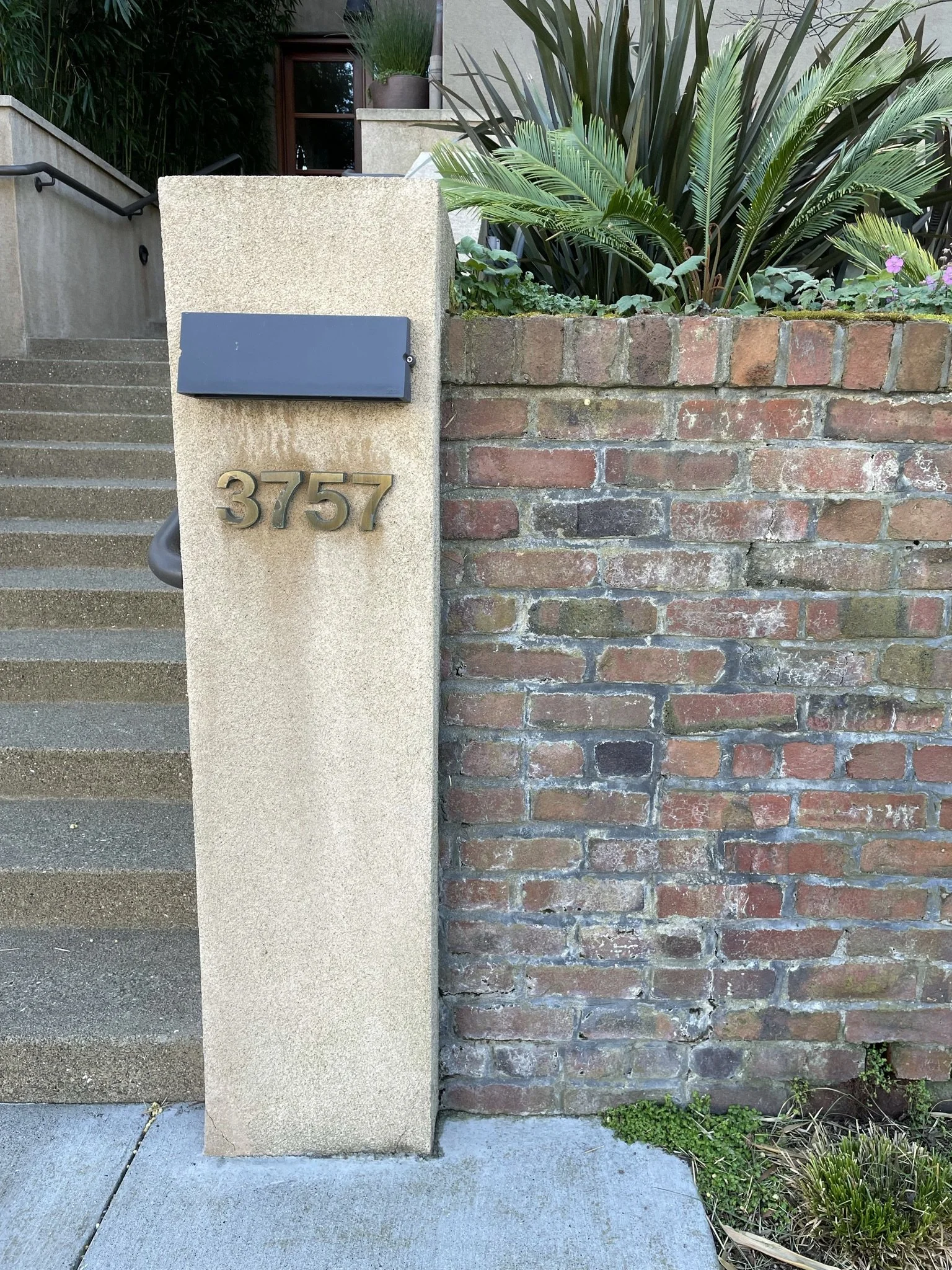
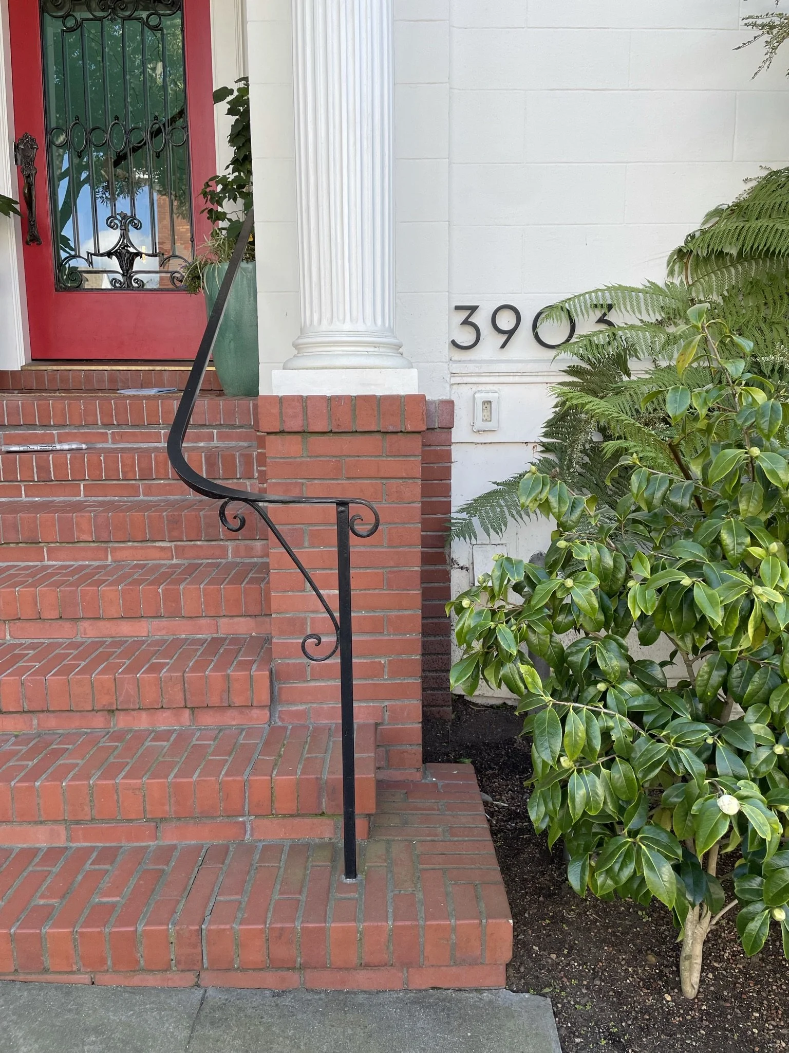
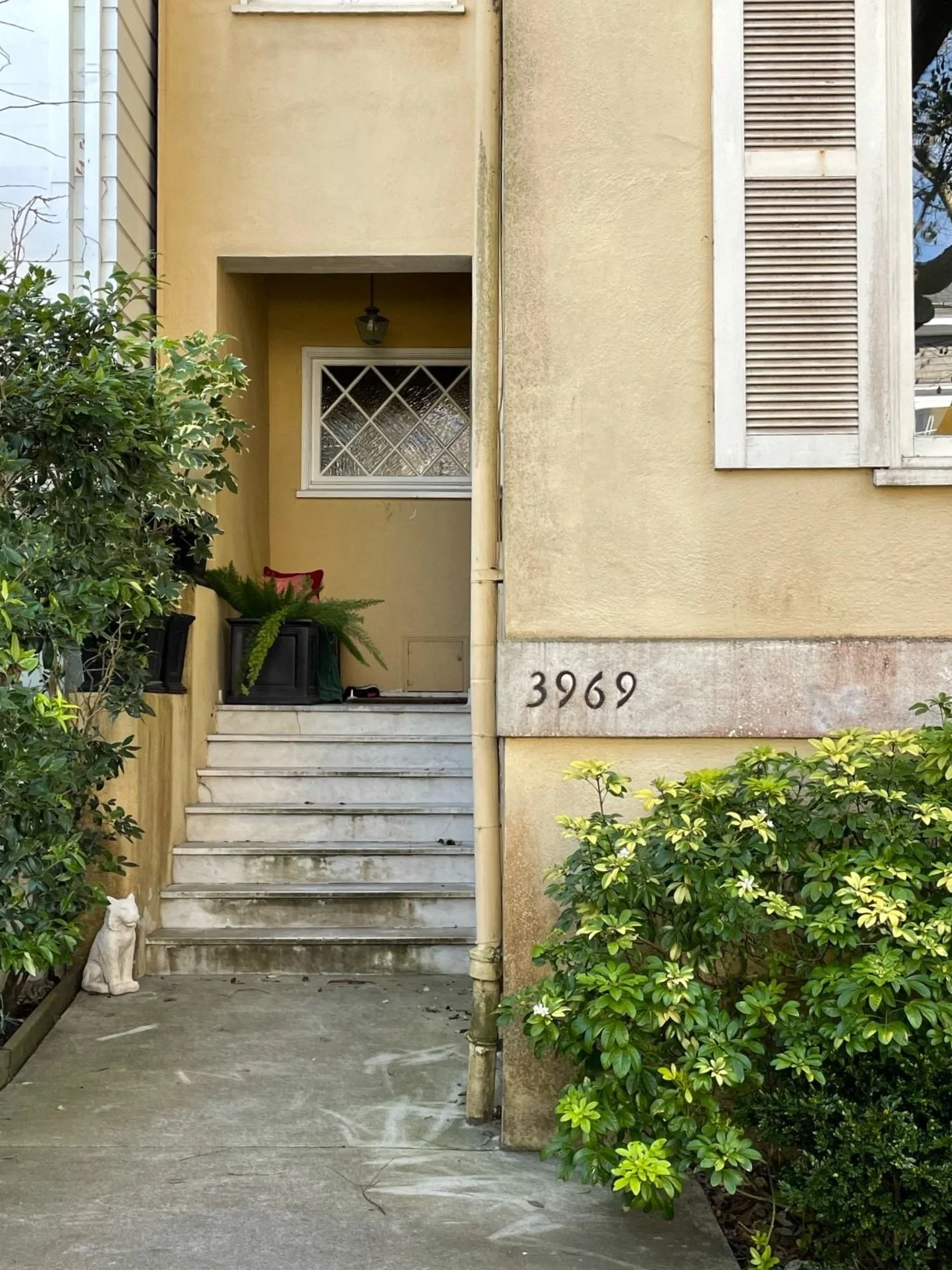
Here are some beautiful (and quirky) examples of addresses that incorporate a variety of fonts, foliage, and formatting.
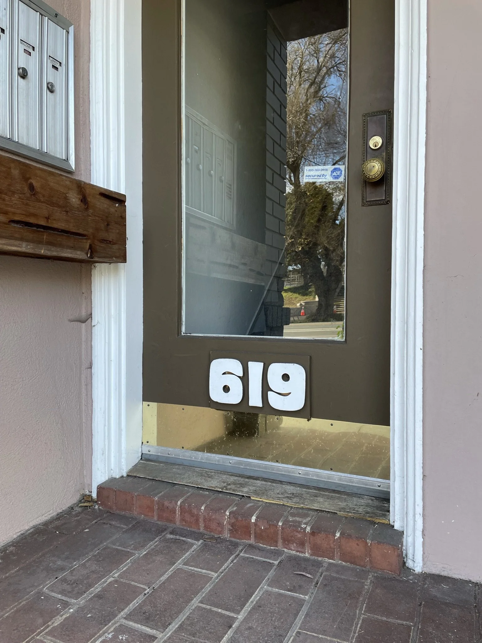
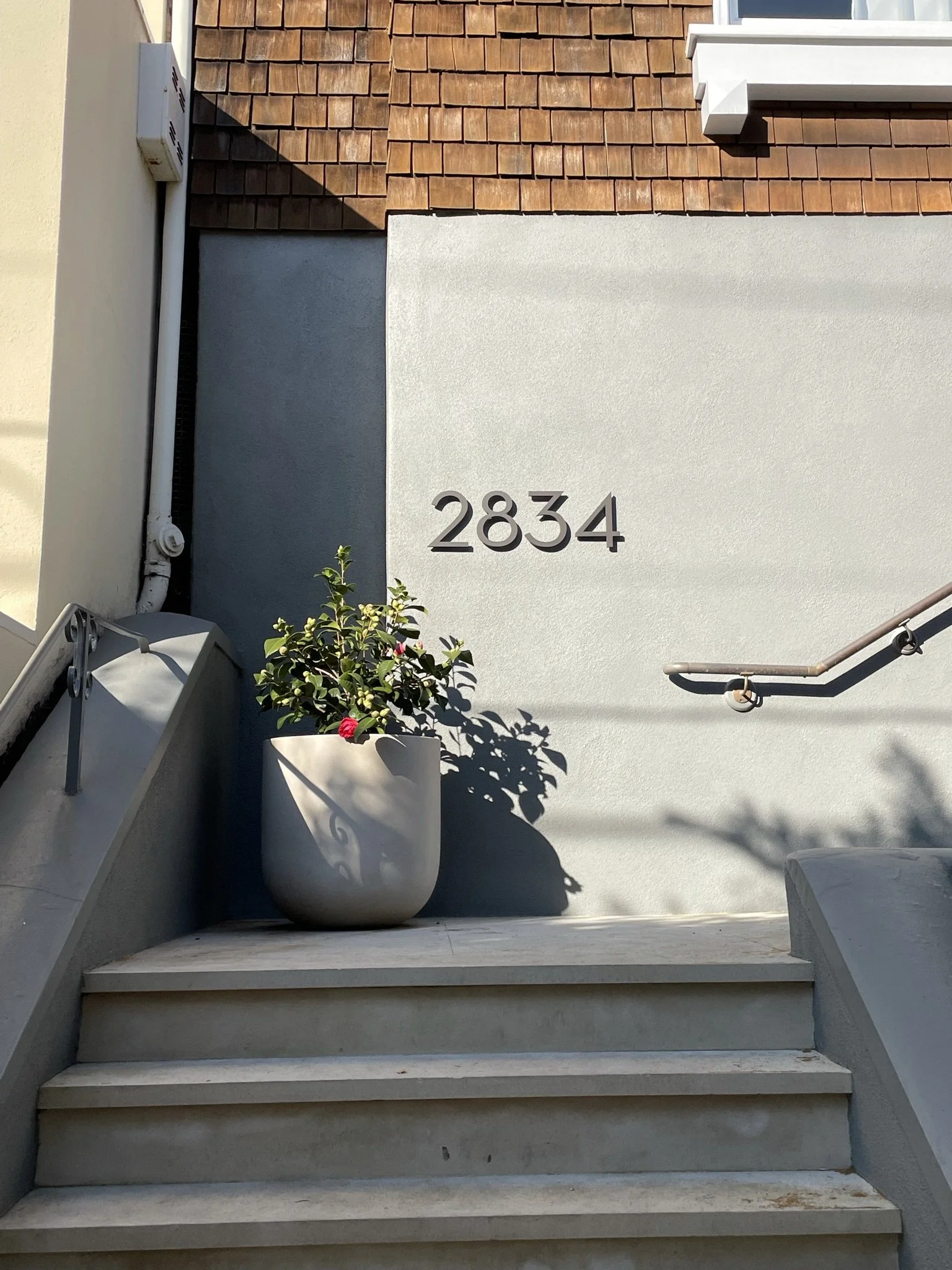
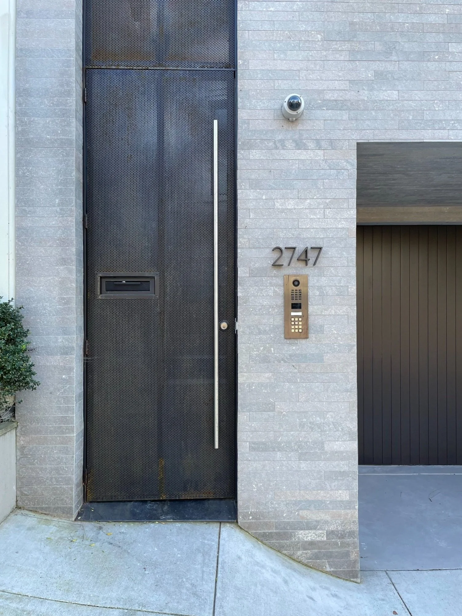
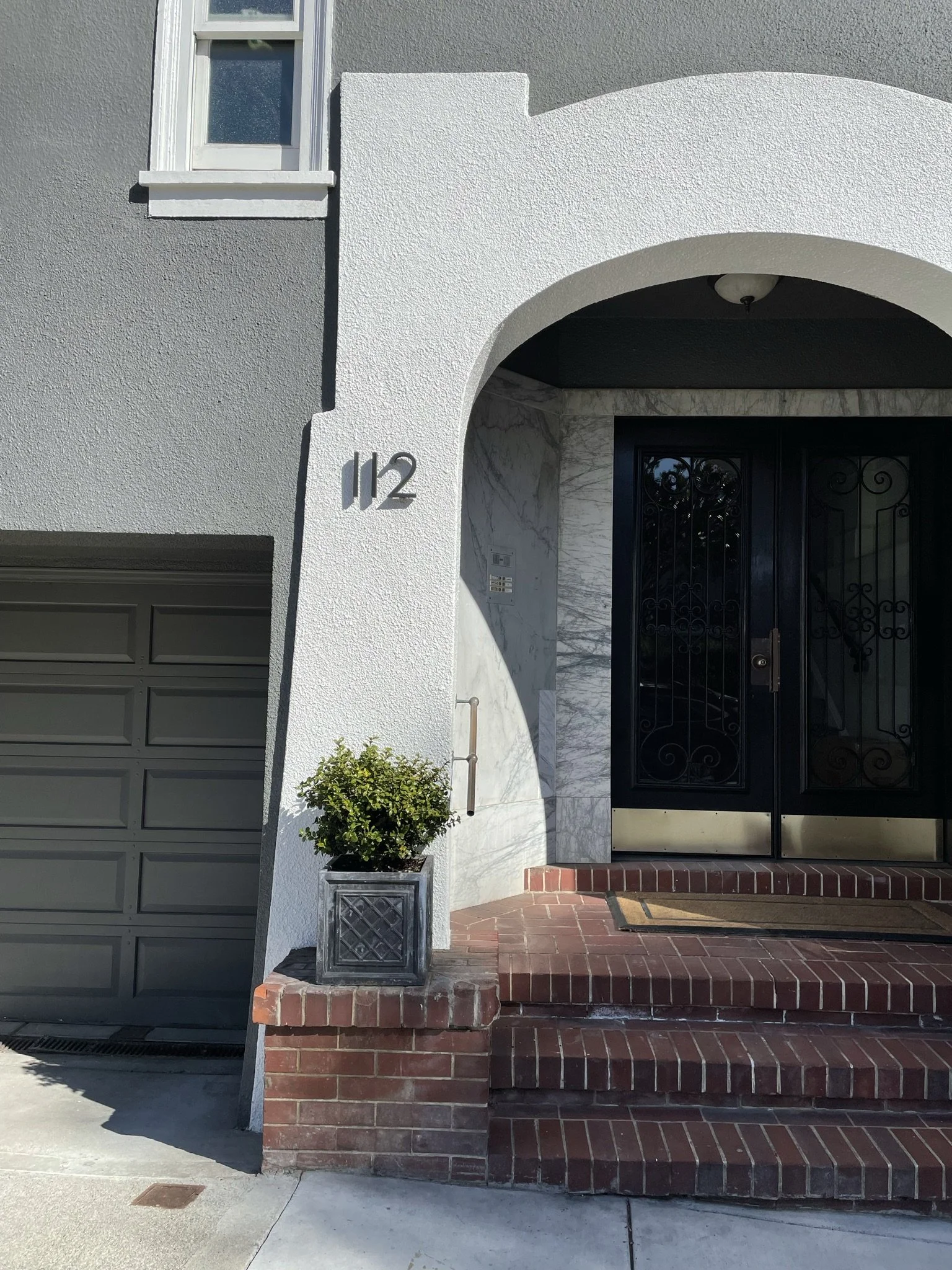
Love, love, love this funky font!
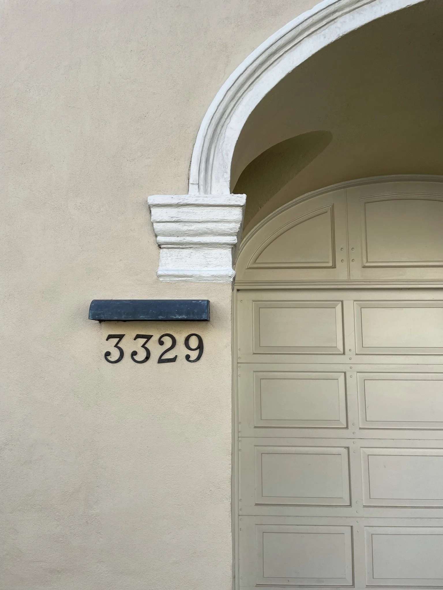
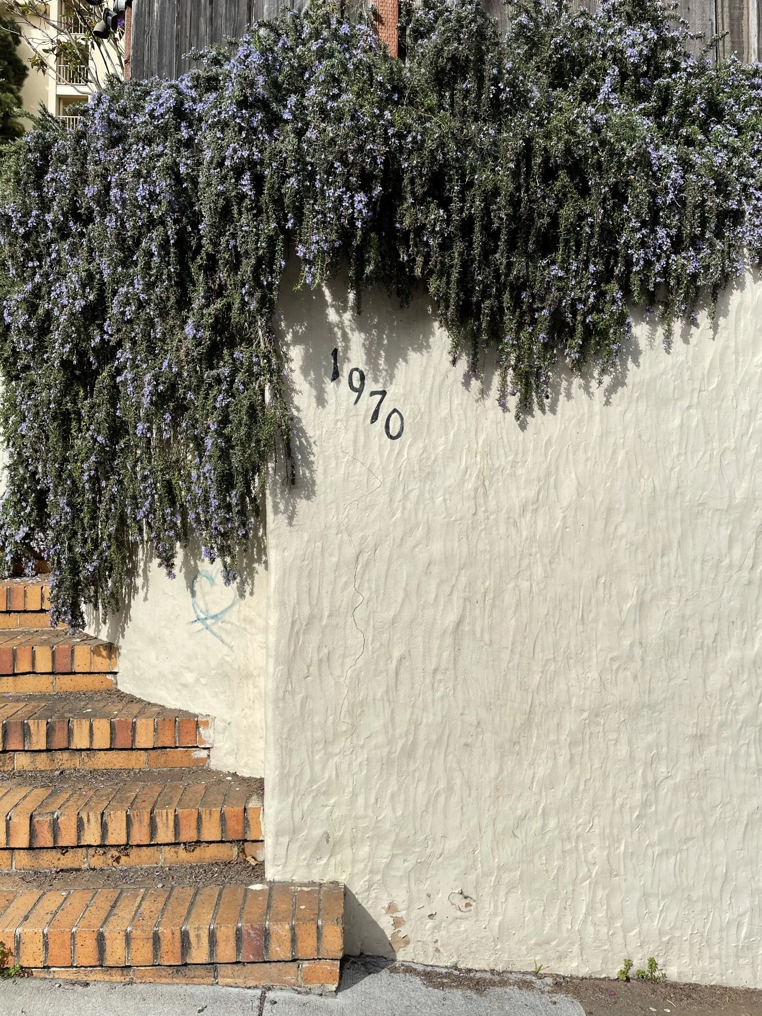
Font or handwriting?
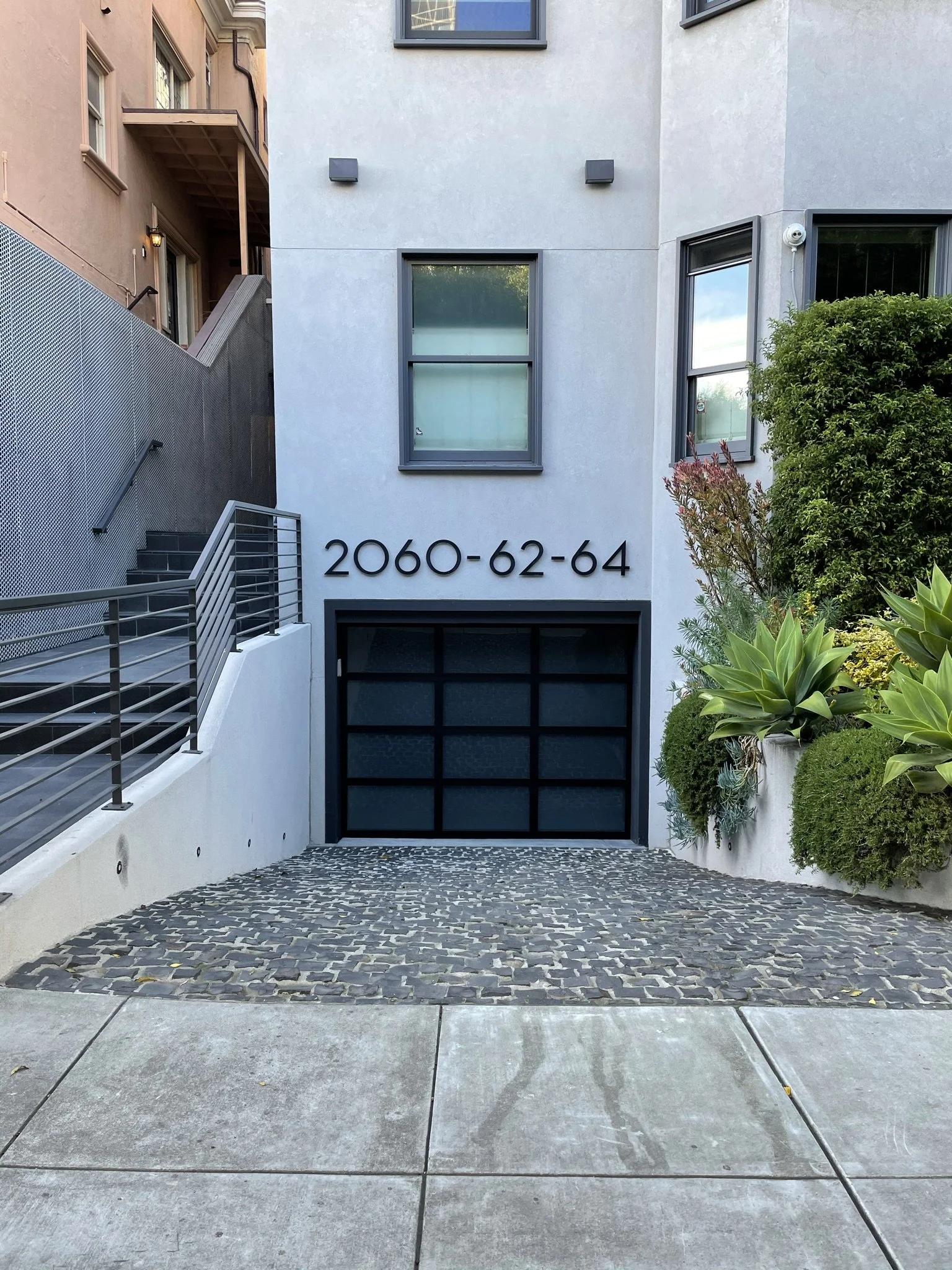
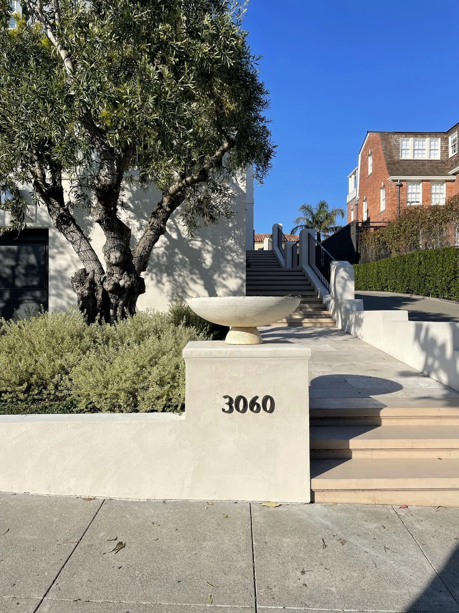
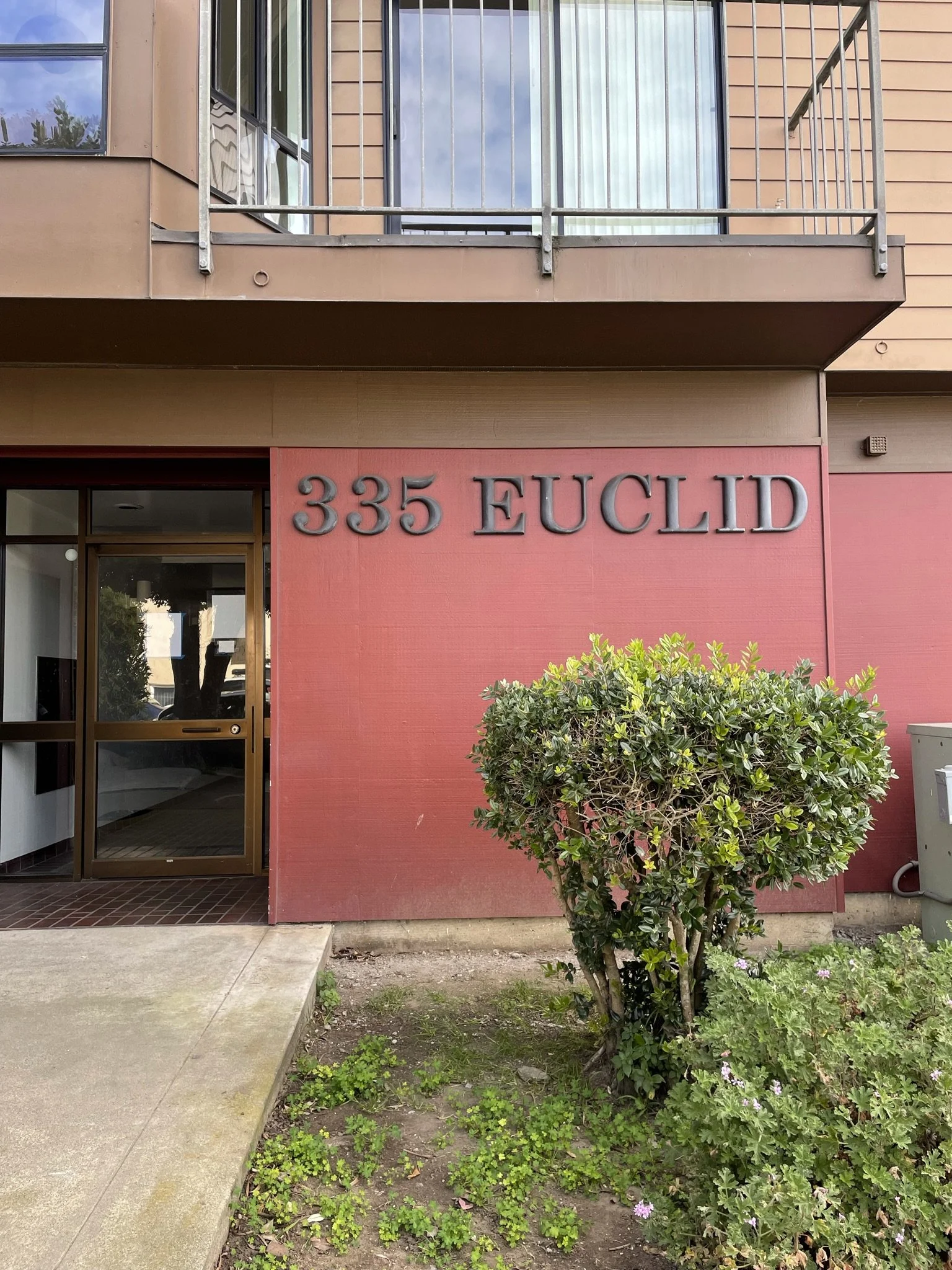
Finally! A font size I can read without my glasses.
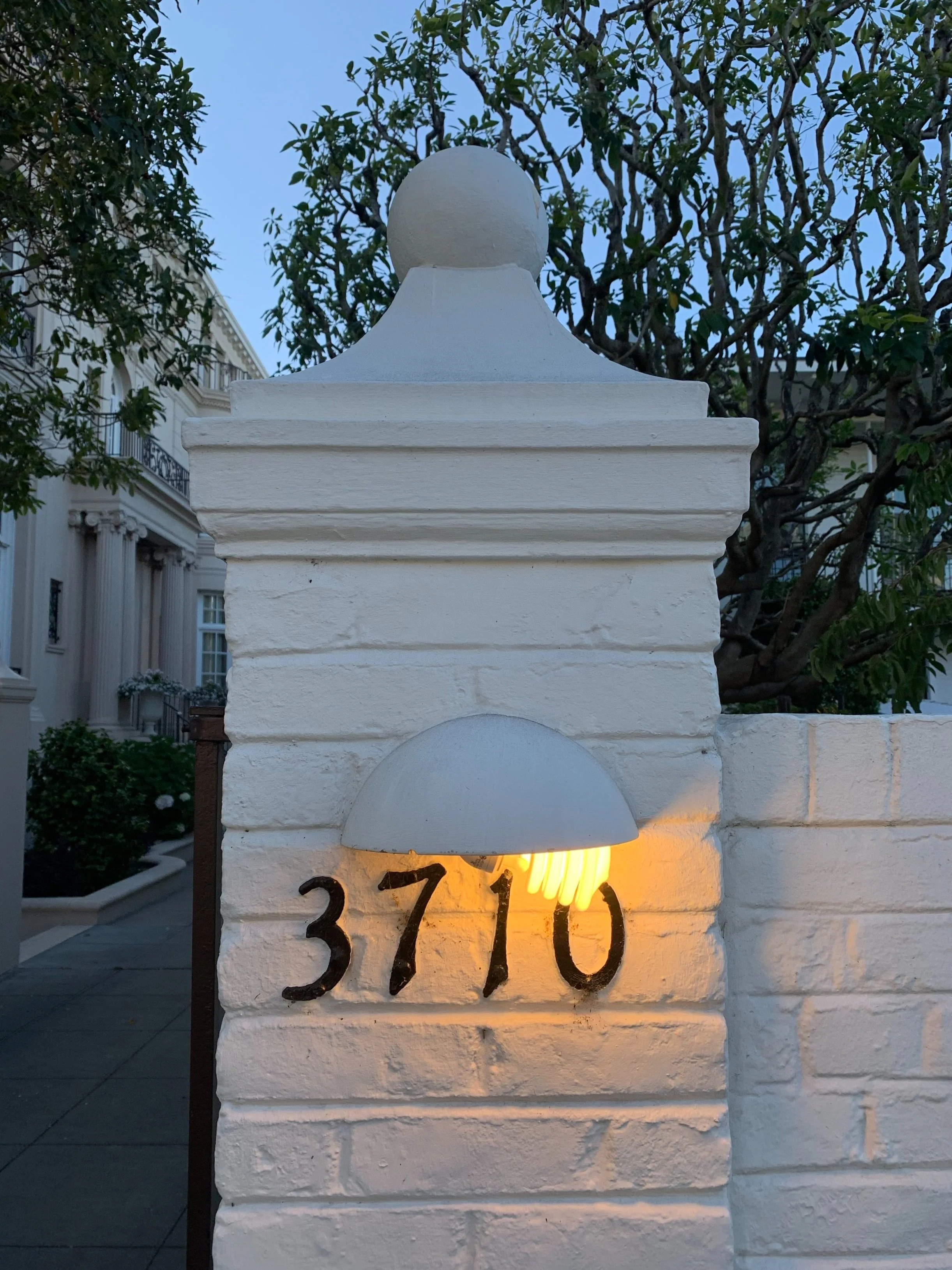
I personally would have chosen a LED bulb, but the fluorescent bulb peeking out here gives this address a very dated flair.
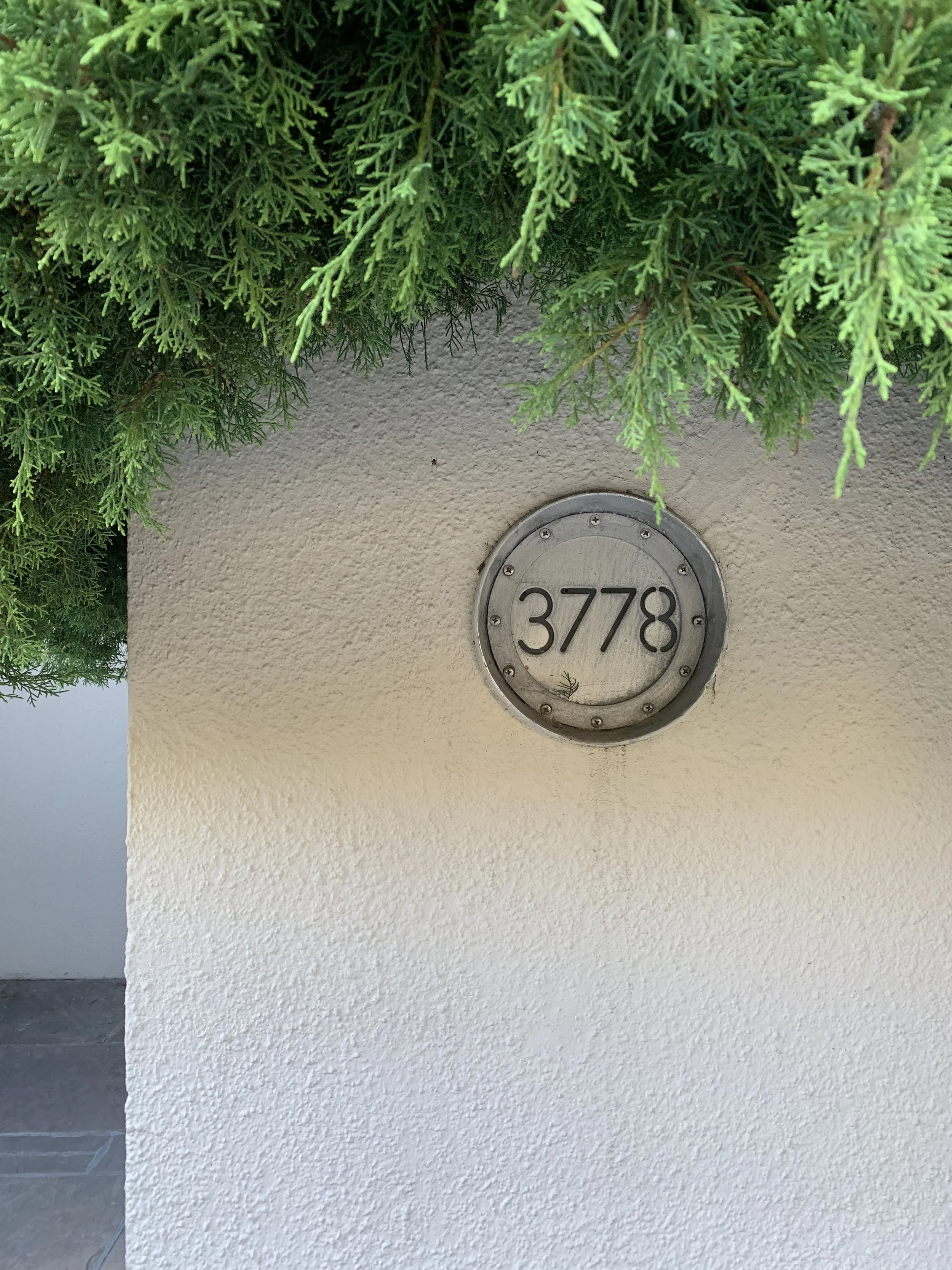
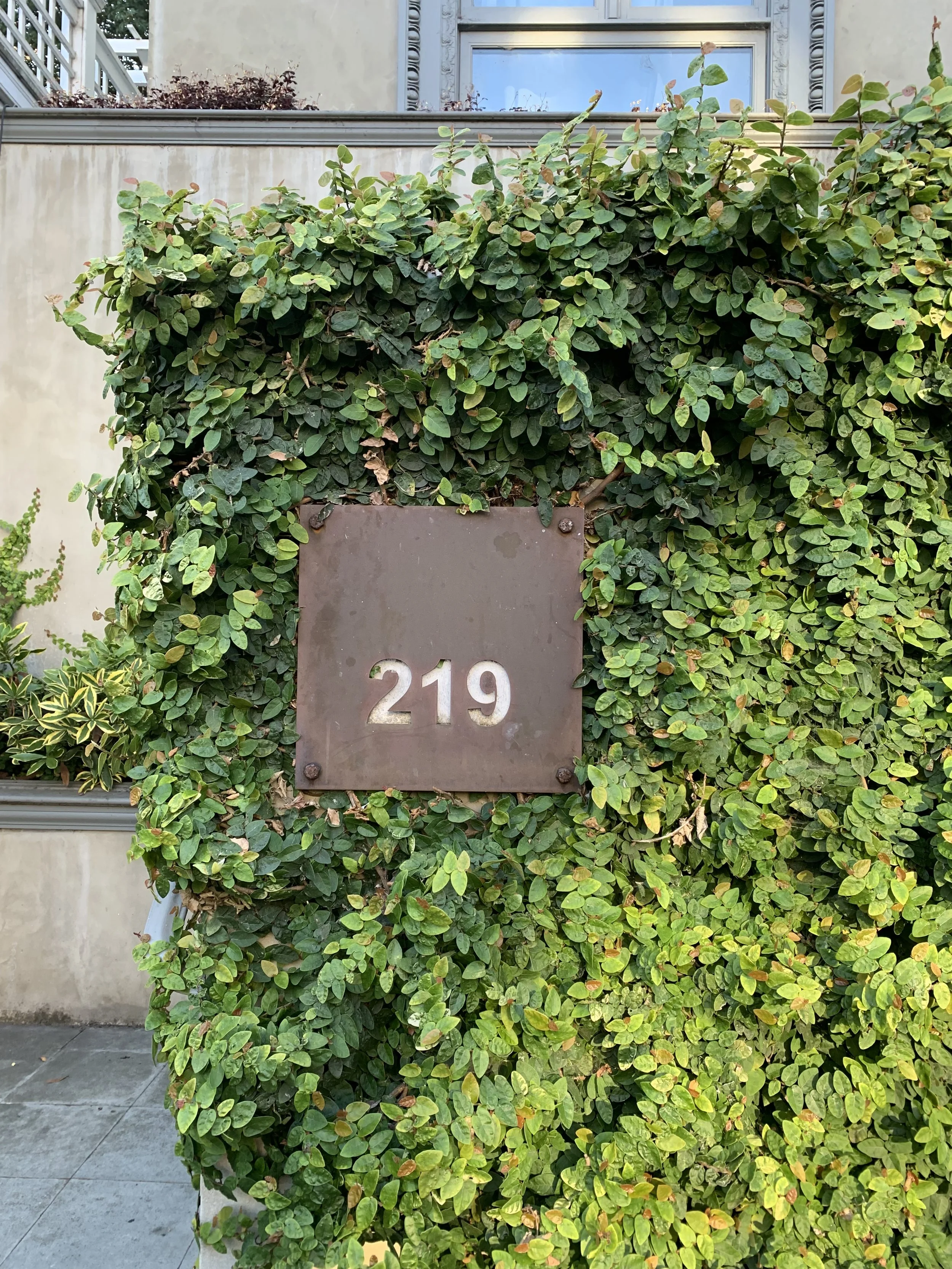
Does this mark a house or a secret garden?
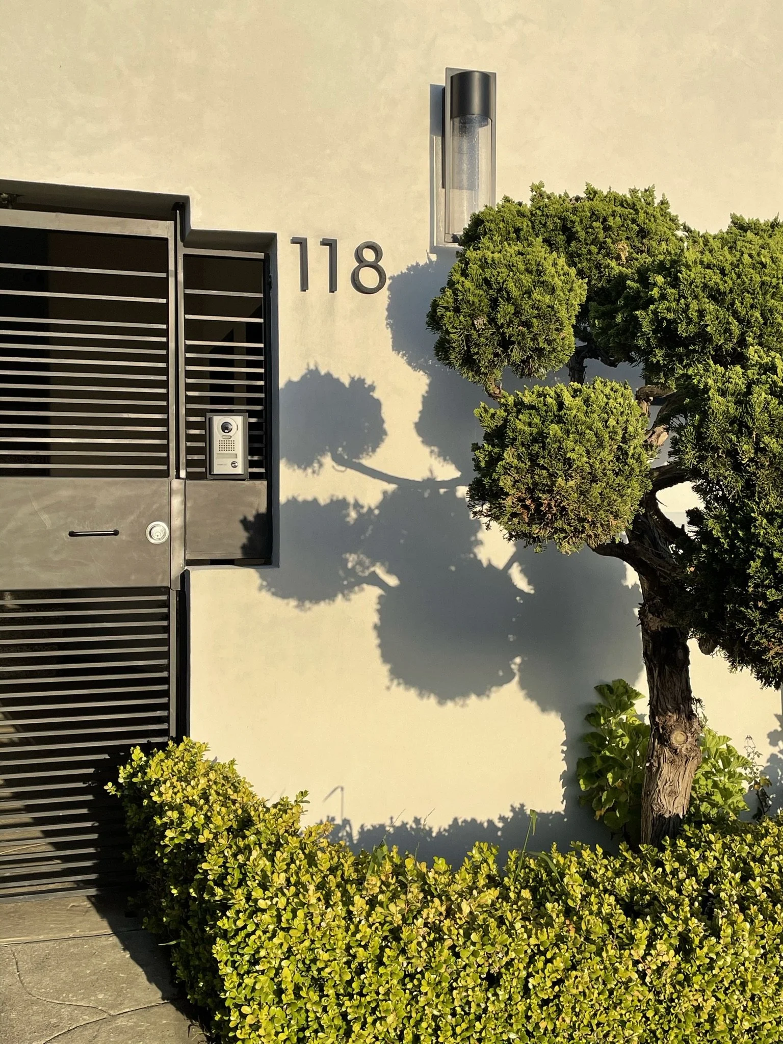
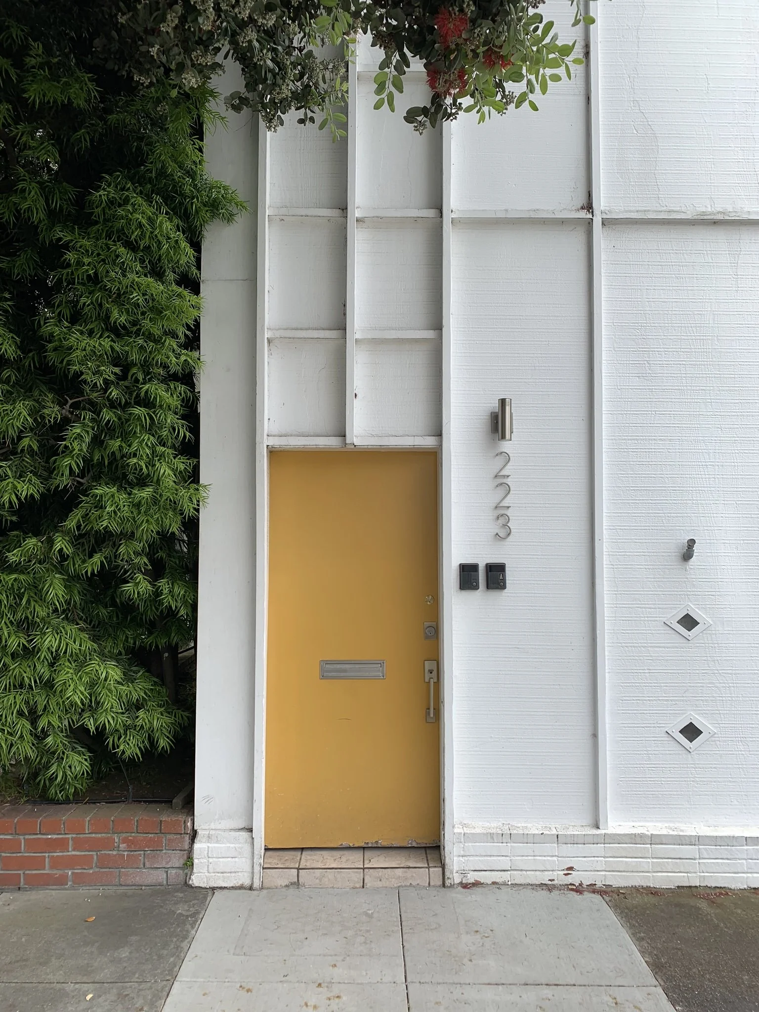
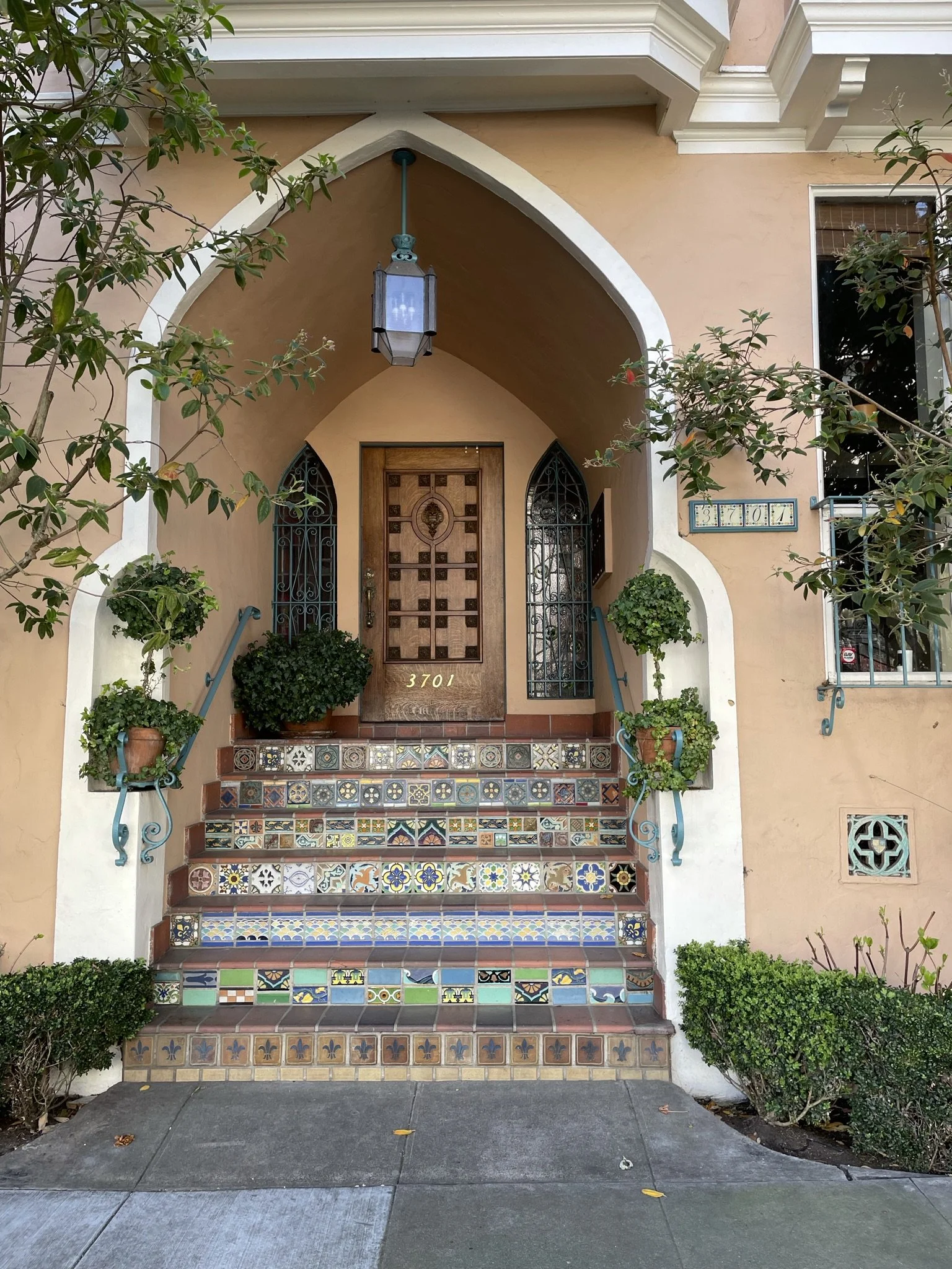
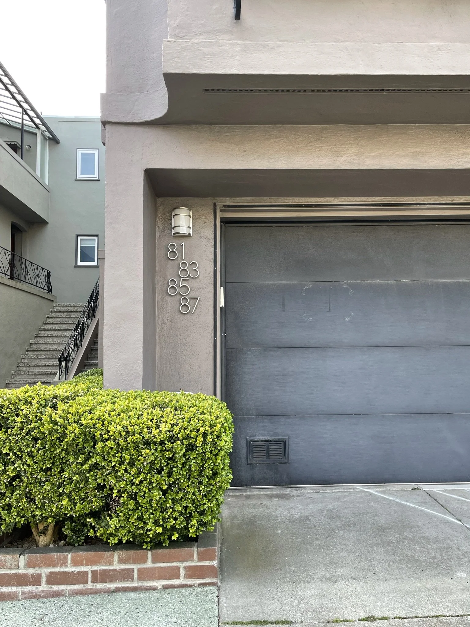
I love the simple framing and pop of color on this entry. The address is also beautifully (and functionally!) placed directly under the wall sconce.
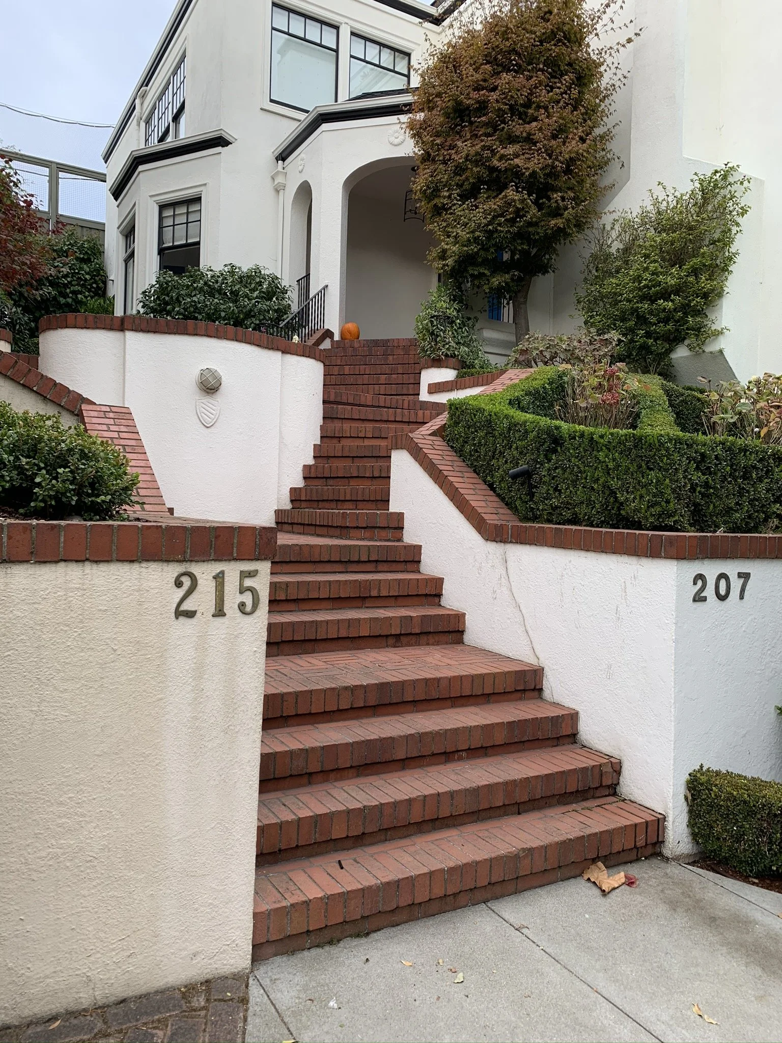
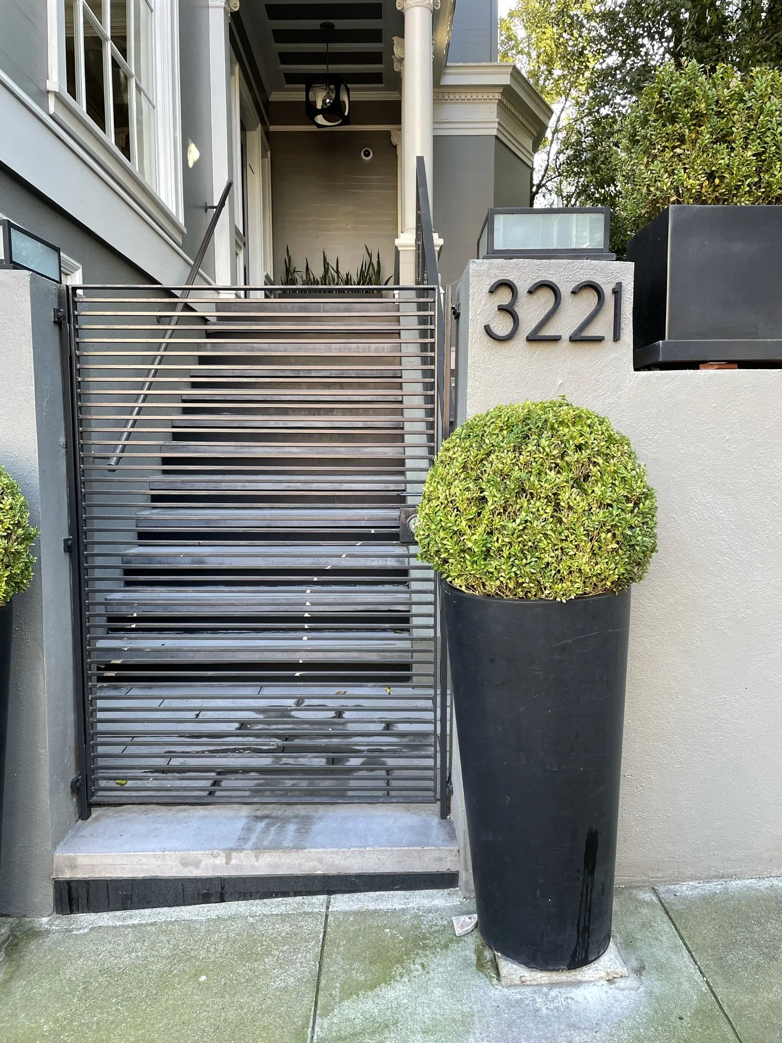
A very squished “1”.
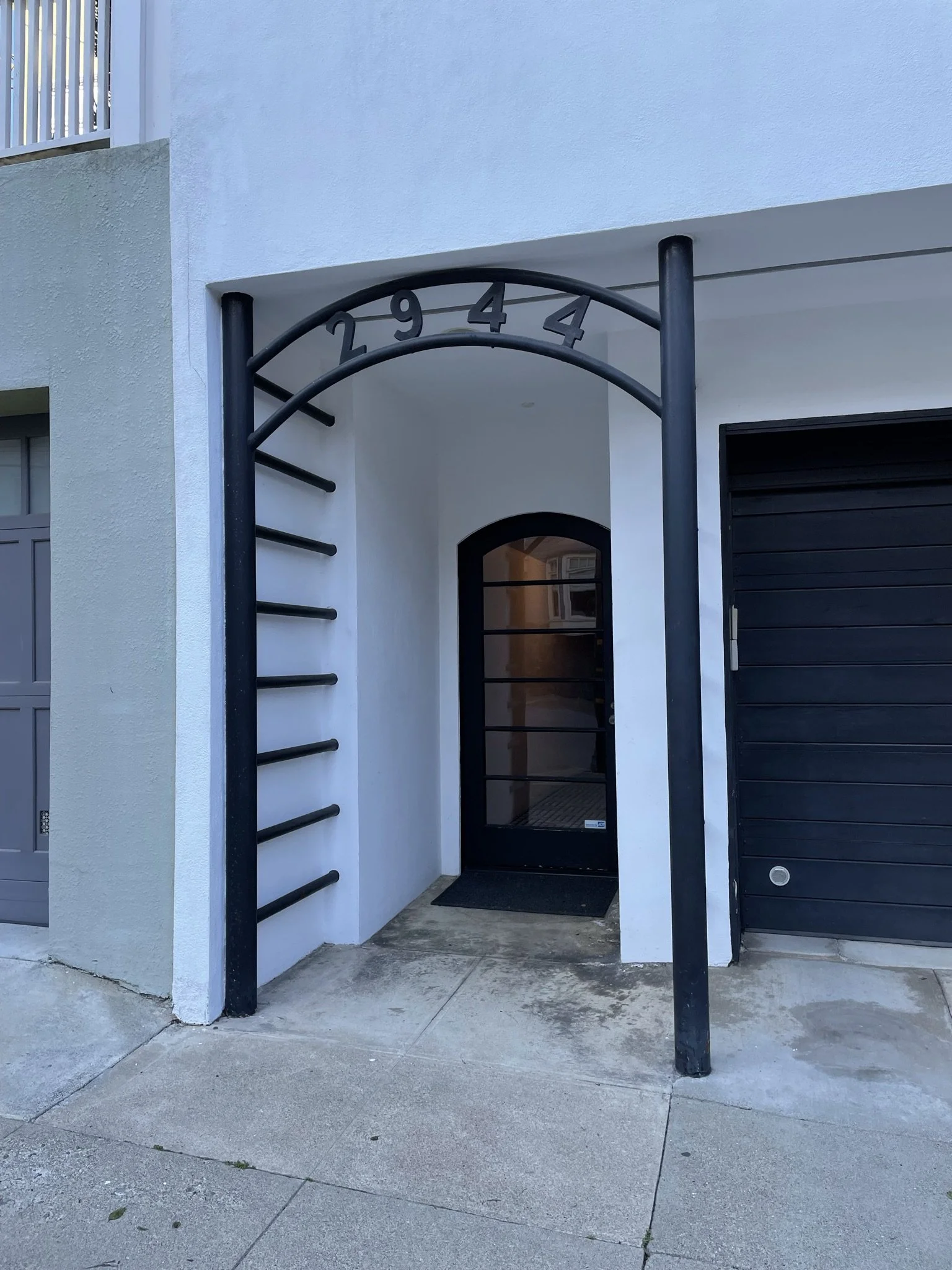
This installation is welcoming- but also a great place to practice pull-ups.
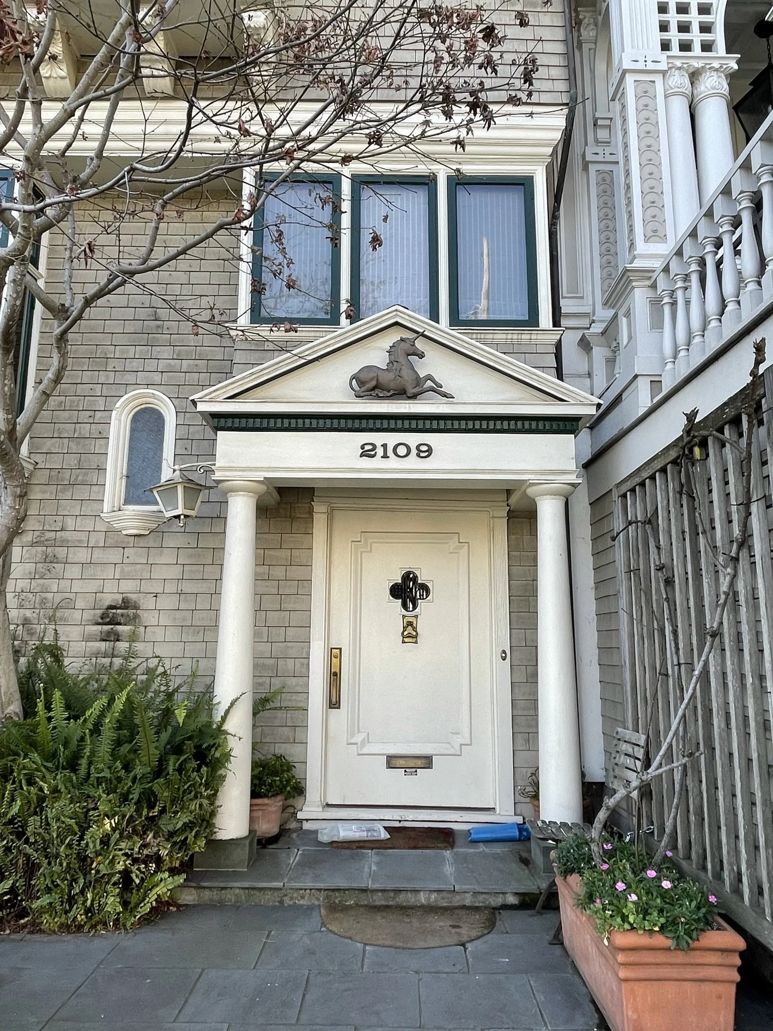
Peep the unicorn above the door!
Legend states that no packages have ever been incorrectly delivered to this address.
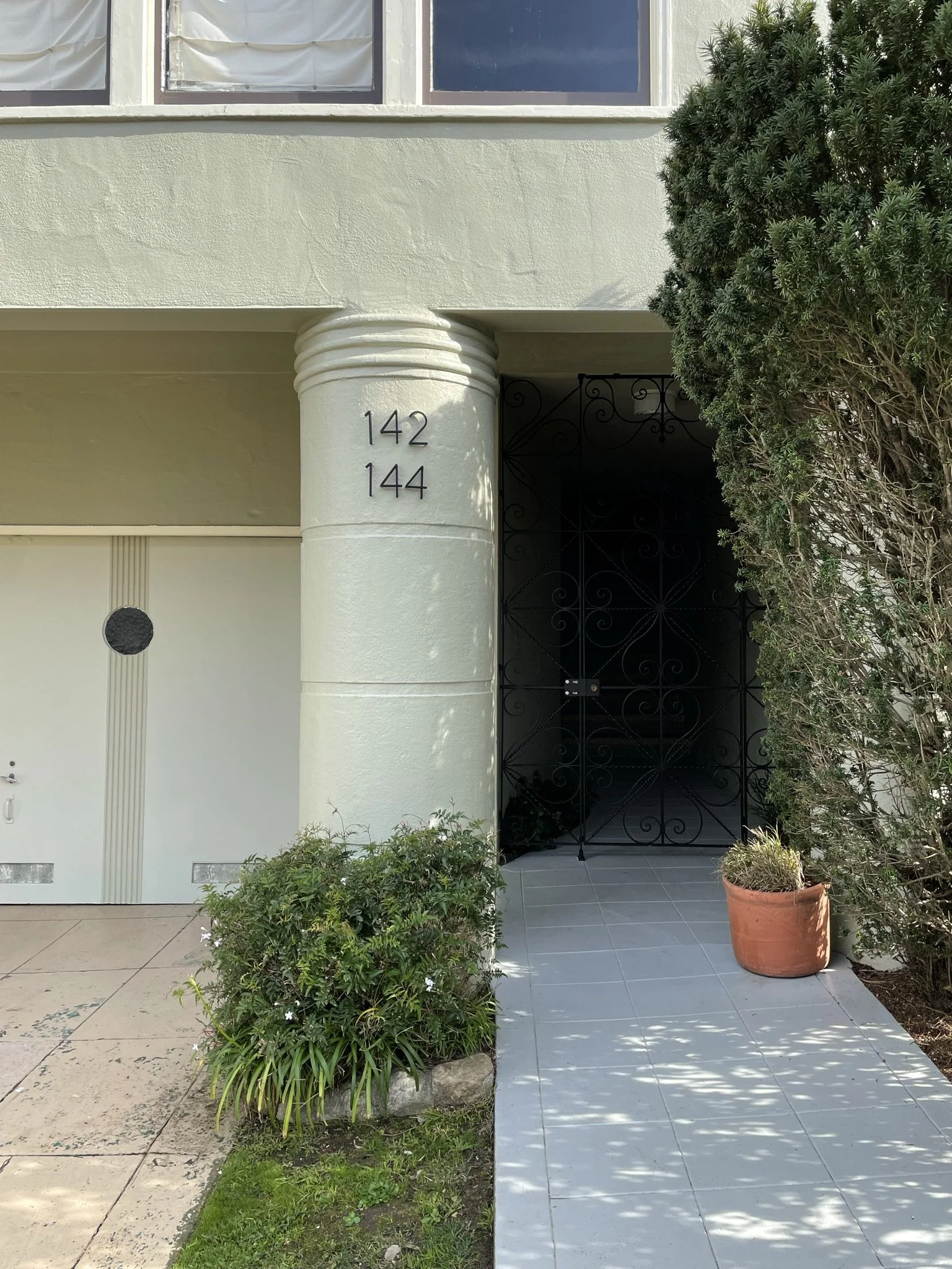
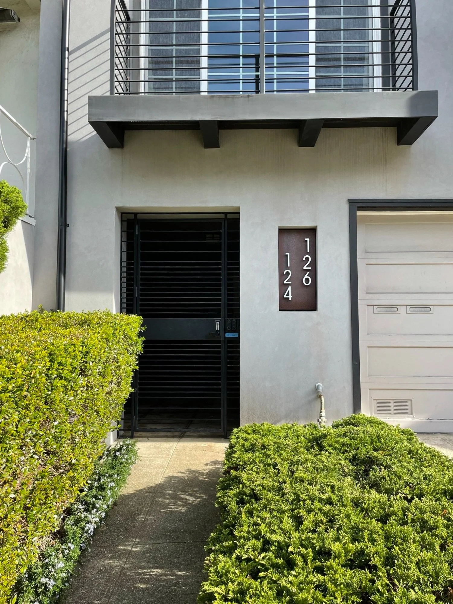
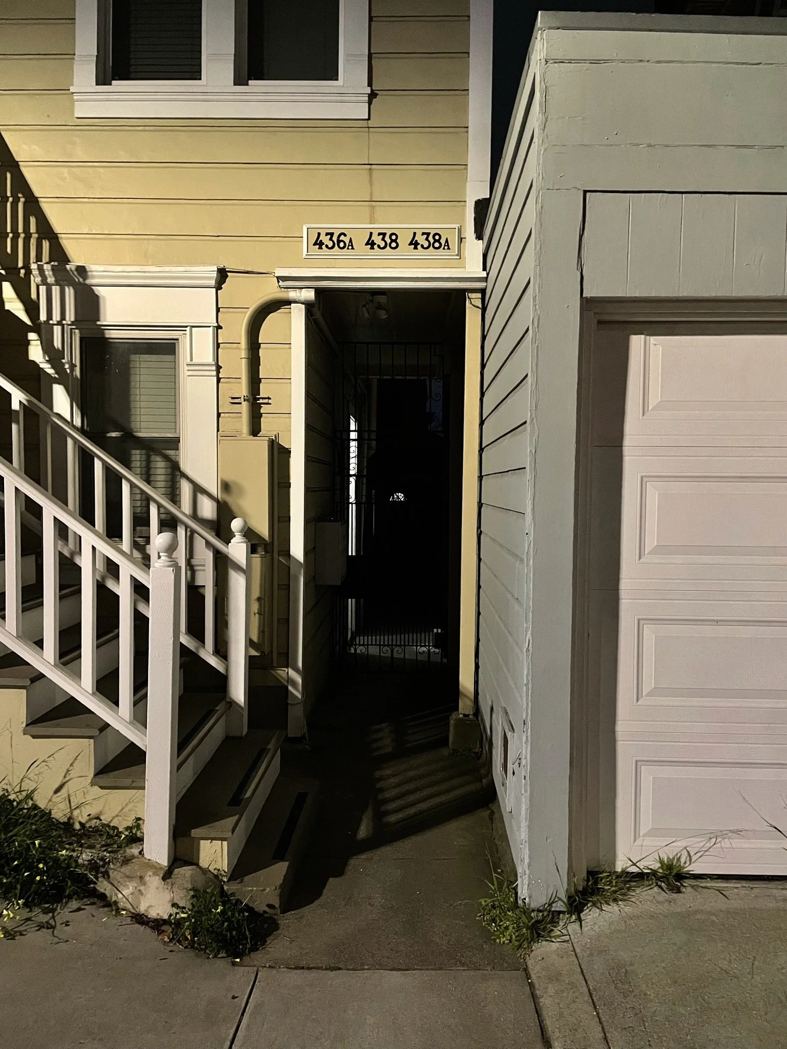
So many addresses!
